Renowned monk Thich Nhat Hahn advised people to prioritize purpose when decorating personal spaces.
He believed a room’s energy improved when infused with intention and individualized style.
Which brings us to today’s topic: meditation room colors.
What is the best shade for a mindfulness space?
Do any color rules apply?
What would work best for you and your trajectory?
Pull up a seat because we’ve got all the answers, plus a list of the seven best paint colors for meditation rooms.
What To Consider When Choosing a Color for a Meditation Room
What should you consider when choosing a meditation room color? Ultimately, the decision comes down to your taste and preferences.
However, we encourage you to mull over a few factors so you’re less likely to be disappointed with your decision.
- Solid vs. Patterns: Meditation rooms should be soothing. So using wild and wacky patterns may not be the best option.
- Mood Considerations: Colors affect mood. For example, red makes us feel more energetic, while yellow excites curiosity and joy. Think about your meditation goals and choose a complementary hue.
- 60:30:10 Rule: If you cannot stand the idea of one solid color, consider using the 60:30:10 rule. Use the main color for 60% of the design, 30% of a complementary color, and 10% of a “pop” hue. The technique adds depth and interest to a space without being overwhelming.
- Lighting: Before picking a meditation room color, think about lighting. How much natural light will flood the space? Will it affect your paint color? What about artificial luminescence? Will you be using lightbulbs or candles? Will your choice impact the hue?
- Finish: Are you a super-high-gloss, satin, or matte fan? Pick one that fits your personality.
Best Color for a Meditation Room: 7 Paint Color Possibilities
Let’s dive into the meditation palette. Remember, though, that these are just suggestions. Ultimately, personal taste will dictate the decision.
1. Plum (Dark Purple)

Plum is underrated as an interior design color. The rich, dark purple makes spaces feel sumptuous; plus, it’s a natural hue that calms the senses.
Deep magentas and mauves also add a sense of mystery and spirituality to a space.
Wood, stone, and metal accessories all work well with plum rooms, and complimentary accents of pink, white, green, and light purple look super.
Notably, Thich Nhat Hanh founded a meditation and mindfulness school called Plum Village.
Pay homage to one of the most significant and influential monks of the 20th and 21st centuries by choosing plum for your meditation room.
A Fun Fact About Plum: In ancient Rome, only the emperor could wear plum and purple cloaks and clothes. So if you’re interested in becoming “spiritual royalty,” plum may be an inspiration.
2. Orange
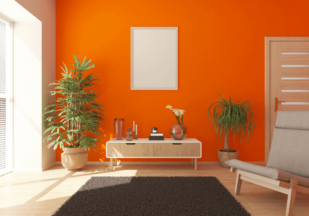
Orange can be a tricky color when it comes to interior design. But when done well, orange is an exciting, striking choice that invites emotional expansion.
You needn’t stick with bright orange; hundreds of hues are in the color family. Salmon, for example, is a popular orange-range option for meditation rooms.
How do tangerine-colored hues affect mood? They’re energetic and can imbue one with a sense of optimism, freedom, and enthusiasm.
What shades pair best with oranges? Go with white, light grays, browns, and greens.
A Fun Fact About Orange: Impressionist master Vincent Van Gogh used a whole lot of orange in his paintings.
3. Yellow

With the hues of sunflowers, lemons, and bananas, yellow is arguably the happiest color of the human experience.
Back in the 1970s, yellow was everywhere. Gold and mustard were all the rage — from kitchens to leisure suits. But these days, people are a bit more afraid of using the bright hue.
We say throw caution to the wind and with nature’s “gold.” Light yellows can make a room feel magical, and deep mustards embody an air of sophistication.
Reds, blues, light grays, browns, and whites all work as accompanying colors.
Sunshine shades exude joy, warmth, clarity, and curiosity, making them excellent options for mediation rooms.
A Fun Fact About Yellow: In Japan, yellow is the color of courage.
More Related Articles
15 Powerful Symbols Of Strength And Courage For Women
25 Mindfulness Journal Prompts For Present Moment Awareness
Enhance Your Mindfulness Practice With 13 Mindfulness Worksheets
4. Mint

Are you searching for relaxing meditation room colors? If so, what about mint?
A mix of light blue and pale green, walking into a mint-colored room is like walking into a powder-scented cotton ball. It’s inviting, calming, and peaceful.
Complimentary colors to mint include jade green, white, and gray. Natural wood also looks spectacular against mint walls.
Confidence, prosperity, safety, and purpose are all associated with mint, which are great energies to encourage in a meditation space.
A Fun Fact About Mint: In some cultures, mint green is considered good luck.
5. Sage

Sage is an earthy hue in the green family. Specifically, it’s a blend of slate and citron. A favorite of meditation retreats and eco-friendly companies, sage exudes natural sophistication.
Organic accents made of wood, wicker, and macrame are the way to go in sage-colored spaces.
Be careful when choosing an exact shade, though. Sage can be tricky and dry much lighter and brighter than expected. It’s wise to do a test patch before committing.
A Fun Fact About Sage: Sage is a quaternary color, meaning it’s an equal mix of tertiary colors.
6. Pink

People have strong feelings about pink. Some love it; others loathe it. We think pink is pretty great because it’s optimistic. Pink also encourages emotional equilibrium.
These days, most people associate pink with femininity, but in the mid-20th century, it was seen as a masculine color.
If you choose pink, we recommend using a lighter shade. Hot pink may be a tad too excitable.
A Fun Fact About Pink: According to the Solar Thai Calendar, pink is associated with the second day of the week.
7. Off-White

Many people assume pure white is the best way to go for a meditation space. And sure, it works for some rooms. But pure white can be too bright. We suggest you go with an eggshell or off-white hue.
Whites make spaces look bigger. It’s also great for multi-colored accents.
Pay close attention to the room’s lighting. You don’t want something that may be blinding at certain times of the day because of how the sun hits it.
A Fun Fact About White: White was the first color used in art made by prehistoric cave people.
FAQs about Meditation Room Colors
Do you still have questions about meditation room paint colors? Well, we’ve got answers to some of the most common ones.
What color is associated with meditation?
What color is associated with mediation? In short, there isn’t just one.
Meditation colors are governed by the chakras, each with an associated hue, and it’s common to see colors during mindfulness sessions.
For example, individuals see purple in their early meditation days because it’s the color of spiritual self-awakening. Similarly, advanced practitioners associate yellow with a cognitive upgrade.
What color represents meditation in Feng Shui?
Feng shui — aka Chinese geomancy — is the ancient art of harmonizing a room’s energy.
And while no one hue represents meditation according to feng shui rules, color is a critical consideration because it carries visible and invisible vibrations.
Ideal feng shui colors depend on location, size, room features, and even the lunar zodiac sign of the individuals occupying the space. The amount of earth, metal, wood, water and fire elements in a given room also plays a role.
What is the color of Zen?
Zen doesn’t have a single representative color, but some schools of thought consider neutral colors, like khaki green, light pinks and purples, soft browns, and grays, to best represent the ideal flow state.
Indigo is another color some people associate with Zen.
Final Thought
Have fun decorating your room! We hope our list of the best meditation colors was helpful.
And remember, life is about impermanence. So if you fall out of love with your initial hue, no rule says you must keep it. Some people change their colors every year based on their lucky lunar colors.
